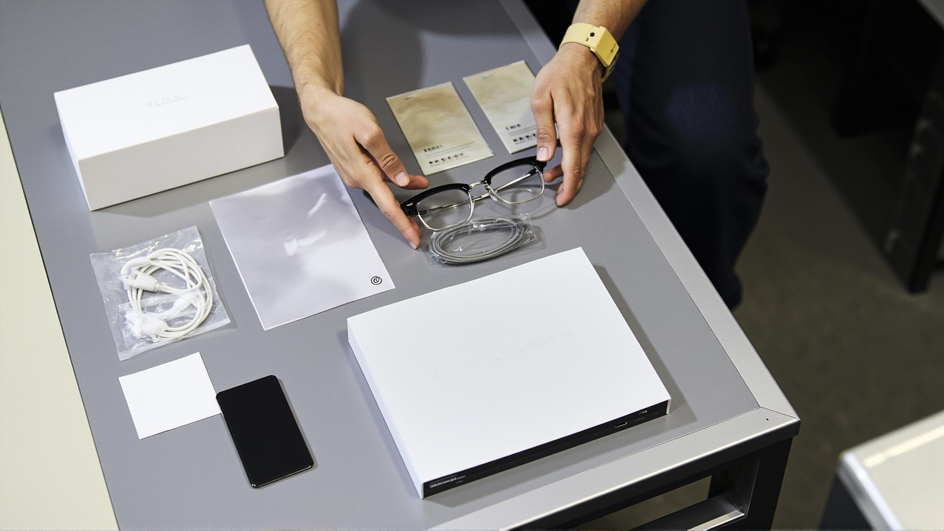

Colour matching in this category means matching more than a frame to a logo. It means matching a finish to a mould to a case to a packaging print to a photograph, and every one of those is a separate process with its own tolerance, its own minimum quantity and its own way of being wrong. The reason it matters commercially is that colour is the cheapest customisation in the menu and the one most often chosen first, which is exactly why it gets under-specified. A brand that decides its colours in the same meeting it decides its packaging has decided the one thing that everything else in that meeting depends on.
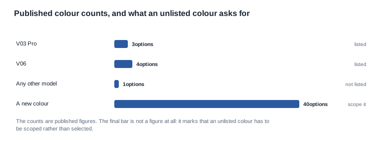
The published colour options in our range are three for the V03 Pro — orange, off-white and black — and four for the V06 — orange, white ice blue, black and black ice blue. Those two lists are the only published colour positions we hold, and they are the whole of what can be treated as available without further work. Everything else is a question rather than an option, and the difference is worth stating plainly at the start because a brand that discovers it at the tooling stage has already committed its schedule., and the difference between a finish decision and a commissioning exercise is the difference between weeks and months. The way to evaluate the options before you commit is therefore a shortlist exercise with one criterion: how far each requested colour sits from a colour we can produce against an existing mould. A request that lands on a published option is a selection, and everything else is a project with a schedule attached.
That makes customization options color matching a question about where the colour actually lives in the product rather than about which colour to choose.
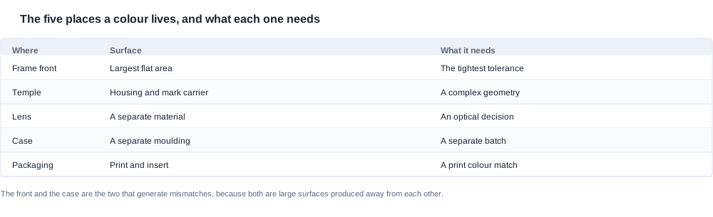
Customization options color matching: five places a colour lives
Every one of these is a separate production decision with a separate owner, and the practical consequence is that a colourway is only as consistent as its weakest component. A perfect frame with a slightly off case reads as a fault in the frame, because the frame is the part the customer holds when they notice.
1. The frame front. The largest visible surface, and the one with the least tolerance, because a large flat surface shows a variation that a small one hides. A gradient across the front of a frame is visible in a way that a gradient on a hinge is not.
2. The temple. In this category the temple is the housing as well as the visible surface, and it is where the logo usually goes. A temple that has to carry a cell and a board is a more complex geometry, and a complex geometry takes a finish more evenly and holds a colour less predictably.
Where the lens is electrochromic, the colour changes with the environment rather than sitting still, and a tolerance written for a static colour does not describe it. Any claim about lens behaviour therefore has to be framed as a change over time, which is a harder thing to specify and a harder thing to photograph for reference purposes.
3. The lens. If the lens is part of the colour story it is a separate material with separate optics, and a tinted lens changes what a camera behind it sees. Our published position on the light-responsive entry is Bluetooth 5.4, a 100 mAh cell, under two hours to charge, roughly seven hours of runtime, magnetic charging and electrochromic lenses, with no model designation and no lens performance figure of any kind — so any colour claim that rests on the lens has nothing published to rest on.
4. The case. The second-largest object in the box, and a separately moulded component. Case capacities of 900, 1200 and 1400 mAh appear across our range, and a case in a different colour from the frame reads as a mismatch even when both are individually correct.
7. The accessories in the same view. A cable, a strap or an insert that sits in the same view as the frame contributes to the perceived colourway even when it is not part of the specification, and a mismatch there is noticed in the same way a mismatch on the case is noticed.
6. The mark itself. Where a logo sits on a coloured surface, the perceived colour of the mark shifts against its background, and a mark approved on a light frame may not hold on a dark one. That is a separate approval from the colour and it is routinely skipped.
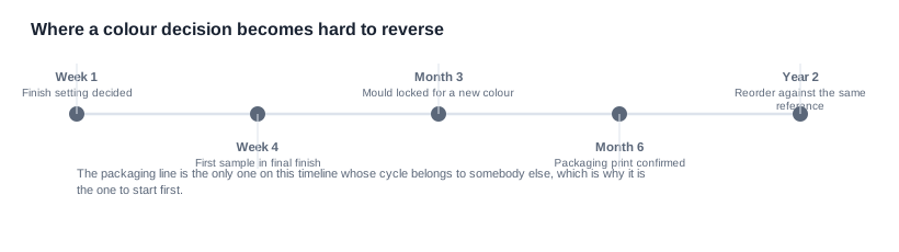
5. The packaging. The print, the insert, the label and the manual. A packaging print in a colour that does not exist as a standard print colour is a specification problem, and a brand's own colour frequently is exactly that. It is also the only one of these that is not made in the same building, which is why its lead time behaves differently from the other four.
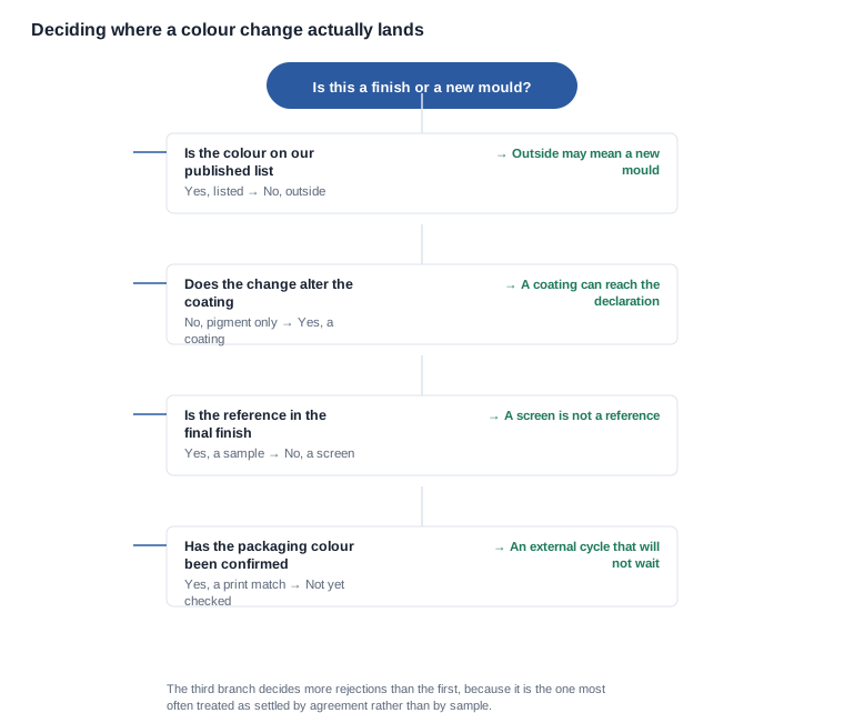

The five questions to ask before specifying a colour
7. Does the change touch the lens? A colour in the housing and a colour in the lens are two different commitments with two different suppliers behind them in most cases, and a requirement that spans both should be split into two lines on the order rather than one.
1. Is this a finish within an existing mould, or a new mould? The published colour options are the model for the first case. A colour outside them may be the second, and the tooling requirements are set out on the tooling page.
The reason this matters commercially rather than technically is that two of these processes carry a tooling or setup charge and the others do not. A buyer who specifies a colour without a process will be quoted for whichever process the supplier defaults to, and that is not necessarily the cheapest one for the volume they intend.
9. Who reorders, and when? The colour question is settled once and then inherited by whoever runs the second order, usually a different person. Record the approved reference, the tolerance and the process in the purchase order rather than in a message thread, so the reorder does not become a fresh negotiation with no agreement to fall back on.
2. What is the process? Injection colouring, anodising, painting, spraying and plating are not interchangeable. The process determines the achievable colour space, the scratch behaviour and what happens at the edges where a coating thins — and a frame edge is exactly where a thin coating shows.
There is a fourth question that belongs before the tolerance: what is the master? A colour specified by name, by code and by a physical sample can still diverge if two people are holding different samples. Naming one approved sample as the master, and recording who holds it, removes most of the argument that a written tolerance alone cannot.
3. What is the tolerance, and how is it judged? A colour tolerance has to state a viewing condition and an instrument, or it is a preference rather than a criterion. A gloss finish and a matte finish need different criteria, and a tolerance written for one will be unmeasurable on the other.
A second reason the reference matters is contractual. A sample that is not referenced in the purchase order is not a standard, and a unit produced against an unstated standard is very difficult to reject, because rejecting it requires proving the standard existed.
8. Who owns the approval, and is it one person? Colour approval that is shared between a brand owner, a designer and a factory inspector produces three standards. Naming one approver removes most first-article disputes, and the person named should be the one who will live with the consequence.
6. How many colours will you actually run? This is the criterion that decides more programmes than any of the others. Each colourway is a separate commitment across the frame, the case and the packaging, and a brand that commits to four colourways has committed to twelve. The trade-off between variety and depth per colourway is a commercial decision, and it should be made before the colours are chosen rather than after.
4. What is the reference, and is it in the final finish? A swatch in a different finish is a worse reference than no reference at all, because it will be approved and then rejected at first article. A physical sample in the final finish is the only reference that reliably works.
A fifth question follows from the fourth and is worth asking of any coating, not only a coloured one: what is the effect on the surface the customer touches every day? Scratch behaviour and grip both change with a finish, and both are experienced immediately in use rather than inspected in a factory.
5. What happens to the documentation if the colour is a coating? A coating or treatment that alters the material composition can affect what a RoHS declaration covers, and a declaration not updated after a component change is not evidence of anything.

Note which steps on that path sit outside the factory. The packaging print and, where a new mould is involved, the tooling are both external cycles, and they are the two steps that a delayed programme cannot recover by asking for more effort. Starting them first costs nothing; starting them last costs a production slot.
Two further decisions belong at the front of that path. The first is whether the colour has to be produced at all, or whether a change to the packaging alone would deliver the intended impression — which is a cheaper answer than it sounds, and one nobody asks because the request arrives as a request about the product.

Five things that go wrong in colour matching
The remedy is unglamorous: approve from a physical sample in the final finish, under a stated light, and record the approval in writing with a date. Every one of those five failures below is a version of approving from something that is not the product., and a brand that approves from a screen will reject the first article — then argue that the article is wrong rather than that the approval was.
2. Approving the frame without approving the case. The case is a different mould and usually a different batch, and it is the object the customer picks up first. A programme that has approved only the frame has not approved the colourway, whatever its paperwork says.
3. Forgetting that the finish changes the inspection. A gloss inspection is a stricter inspection, and a product set up for a matte finish will be judged against a standard its process was never capable of meeting. The criterion has to be agreed before production rather than interpreted at inspection.
4. Assuming a new colour is cheap. A colour within a mould is a pigment and a process setting. A new colour may be a new tool, and the customisation lead time page sets out how that changes the schedule.
5. Leaving the packaging until last. A brand colour that is not a standard print colour has a lead time of its own, and it is an external cycle that does not compress when a programme is delayed elsewhere. This is the only failure on the list whose schedule belongs to a third party.
There is a seventh, and it is the one that costs the most to put right. A colour approved against a sample and then produced in a different batch can drift without anything having changed on paper, because the process has a natural variation window and the approved sample happened to sit at one end of it. The mitigation is to approve a tolerance band rather than a single unit, which requires somebody technical to agree to it in advance.
There is a sixth that belongs on the list and is specific to this category. A colour that reads correctly on the frame and the case can still read correctly once the mark is on it, because the mark occupies the surface the eye is using as the reference. Where the mark is small and high-contrast the shift is invisible; where it is large or metallic it is not.
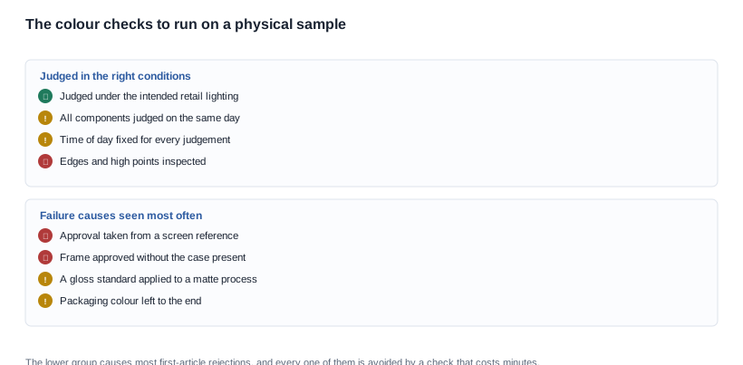
The same checks apply to the case and to the packaging insert, and they are worth running on a second day. Colour that has been agreed in a meeting on Tuesday and is rejected on Thursday is almost always a tolerance problem rather than a disagreement about the colour, because people were comparing against different references.
For a buyer running a due diligence process, the colour question is unusually good value to resolve early. It requires no tooling to answer, the answer is stable, and the cost of asking is one email — whereas the cost of discovering it late is a production slot.

What to check on a physical sample
Where the retail environment is unknown at specification time — which is common for a brand selling through several channels — the sensible default is to approve against two conditions rather than one: a lit retail interior and an unlit domestic room. Those are the two environments a unit will actually be judged in, and they disagree with each other more often than buyers expect. 2. The consistency across the frame front, the temple and the case, in the same light, on the same day. 3. The edges and the high points, where a thin coating shows and where a moulding shows a witness line. 4. The match to the packaging print, held next to the unit. 5. The match to the approved reference, held next to the unit, in daylight.
A fourth condition worth stating is that the reference sample should be retained rather than filed. When a reorder arrives eighteen months later, the sample that was approved is the only object that can answer a question about why a batch looks different, and factories do not keep them by default.
A third condition: judge the reworked sample rather than the first one. A colour that was adjusted after the first rejection is frequently judged against the original approval rather than against the request, which produces an approval that nobody actually wanted.
Two conditions are worth setting explicitly rather than leaving to the day. Fix the time of day at which samples are judged, because a north-facing window and a south-facing one produce different results from the same sample. And judge all components of a colourway together, because the tolerance between a frame and its case is only meaningful when both are present and both have been through the same handling.
What we can substantiate today
We publish the colour options we hold — three for the V03 Pro and four for the V06, and no list for the rest of the range — and we will not present a colour as available for a model where we do not hold that information, and we will not put a Pantone reference into an order without telling you which process it maps to.
We will also be direct that a colour matching exercise needs a physical reference in the final finish, and that a screen approval is not a reference. That sounds obvious and it is still the most common cause of a first-article rejection in this category, because approving from a screen costs nothing and correcting it costs a production slot.
The same applies to the packaging. A brand colour that maps to a standard print colour is a short conversation; one that does not is a specification exercise with an external supplier, and the difference between those two is usually discovered by the printer rather than by the factory.
We will also say which parts of a colourway we hold. A case in a matching colour is a separate moulding with its own minimum, and the honest position is that a brand asking for a matched colourway is asking for two commitments rather than one.
A short answer is usually possible. Give us the model, the colours you want and the quantity, and we will tell you which of them we can substantiate against the published lists and what the remainder would require — without a development project, or with one. That is a question worth asking in the first email rather than the fourth, because the answer determines whether the colour is a line in a purchase order or a project with a schedule.
Where a colour is outside our published lists, we will tell you whether it is a finish setting within an existing mould or a new mould, and we will tell you what each implies for quantity and schedule before a quotation is issued. That distinction is the one that decides whether a colour request is a conversation or a project, and it is the first thing we will tell you rather than the last.
Where the answer is that a colour would have to be developed, we will tell you what development involves rather than presenting it as a colour choice, and we will say which of the seven places above it actually lands in, because a colour on the frame and a colour on the case are separate developments with separate costs., because the two are not comparable and only one of them can be quoted with any confidence. For the wider option set, see customization options and customisation options overview.
Related reading
- The colour lists themselves: standard OEM colour options.
- What the schedule consequence is: customisation lead time impact.
- The commercial side of the same decision: customization options cost factors.
Tell us the model and the colours and we will confirm what we can substantiate.