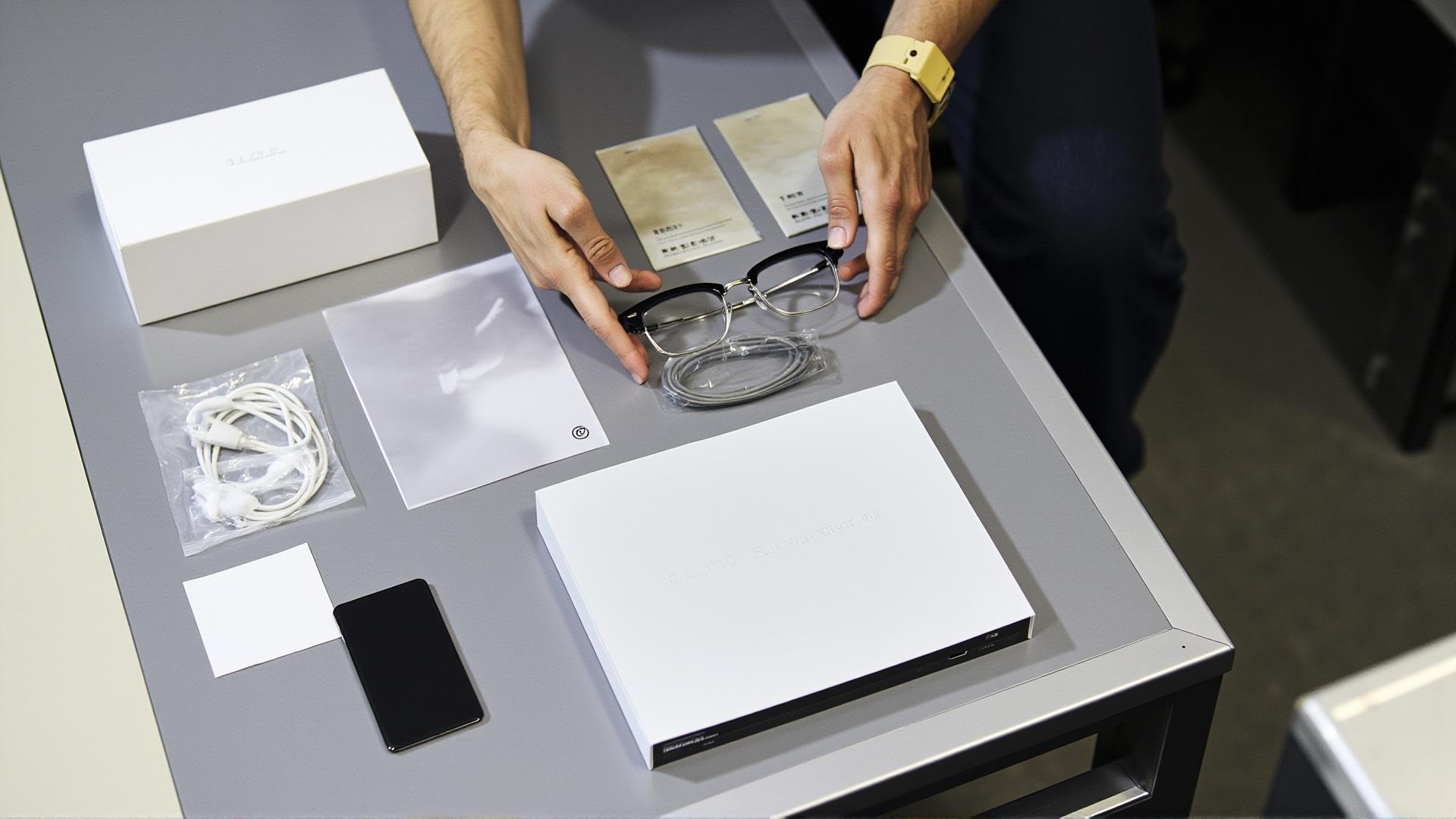
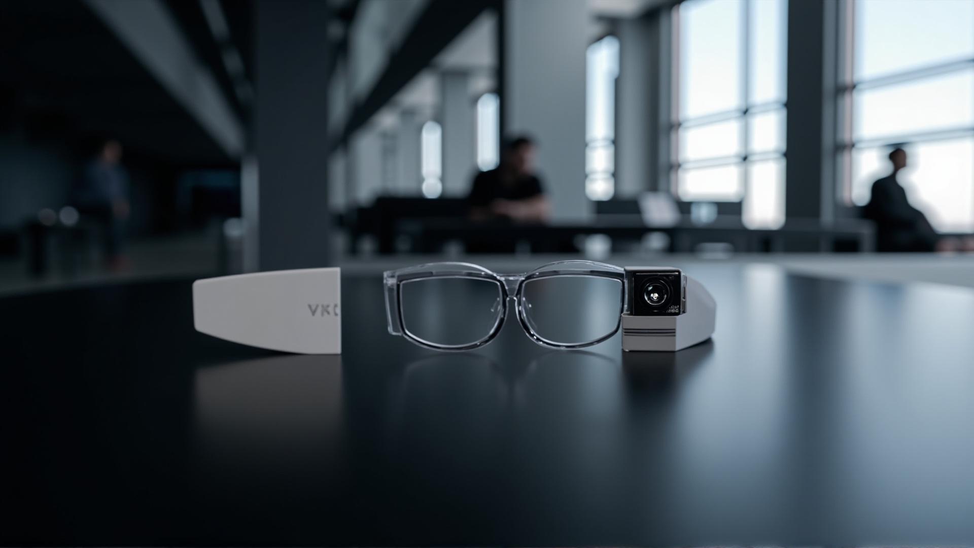
A color programme in smart glasses looks like a pigment decision and behaves like a specification problem. The pigment is easy; agreeing what "your blue" means on a small moulded part, seen under a shop light, next to a screen, is what consumes the schedule. This guide sets out the customization options for frame color that our catalogue actually publishes, the parts of a frame where color behaves differently, and the reference language that keeps a colour programme out of the returns queue.
The catalogue is deliberately thin on color, and it is worth knowing exactly how thin before a brief is written. Two models in the whole range publish a color row. The electrochromic entry publishes the idea of a color that changes, without a model string attached. Everything else is not published, and the correct response to that is a question, not an assumption.
Customization options for frame color: the published facts
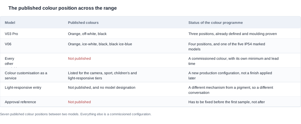
Two entries in the catalogue carry color information, and only two.
The V03 Pro publishes three color options and is the only camera model in the range with photochromic lenses. That combination matters commercially, because a photochromic lens is a color programme that runs on its own schedule — it darkens with light and returns with temperature, and it cannot be matched to a frame color by eye in an indoor review.
The V06 publishes four colors. It is the only other model in the range with any color row at all.
Everything else is not published. That covers the eight audio-tier models — K01 and YK12, D12 and LC-105-1, G07 and K02, and D11 and LC-105-2 — the three sport-tier models — YKC02, D17 and ZH12 — three of the eleven camera models that are not the V03 Pro or the V06, the three kids-tier models — A05, A06 and A07 — the AR glasses entry, and the bone conduction entry.
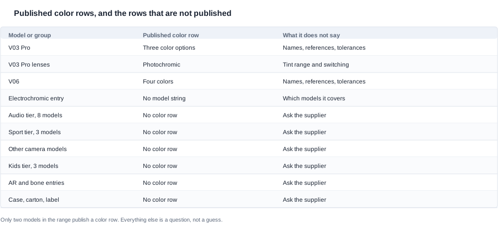
The practical consequence is that a buyer planning a branded range is planning a development conversation, not a selection from a swatch book. The published list tells you what exists as a standard configuration. It does not tell you what can be done for a brand color, how long it takes, what it costs, or how many units of a color must be ordered.
So the criteria for a color requirement should be set before anything is quoted:
- Is the shape unchanged? A color applied to an existing mould is a finishing change. A color that arrives with a new temple profile, a new nose bridge or a new front shape is a tooling project, and the two are quoted differently.
- Which surfaces are in scope? Front, temple, temple tip, hinge and hardware, inner rim, and then the case, the insert, the carton and the label. Each surface has a different process and a different tolerance.
- Is it one model or a range? A range-wide color policy needs one master sample, one reference standard and one rule. Per-model color sampling is the most common source of a program that never converges.
- Is there an existing master to match? If the buyer already owns a physical master part, that master becomes the reference, and the method is comparison against it. If not, the reference has to be created and approved first, which is a step in the schedule rather than a detail inside it.
None of these four criteria has a published number attached to it. Unit price, minimum order quantity, lead time, sample fee and warranty are all not published, and so is every color reference, every tolerance and every per-color minimum. Treat each of those as a line in the quotation request rather than as an assumption carried over from a previous program.
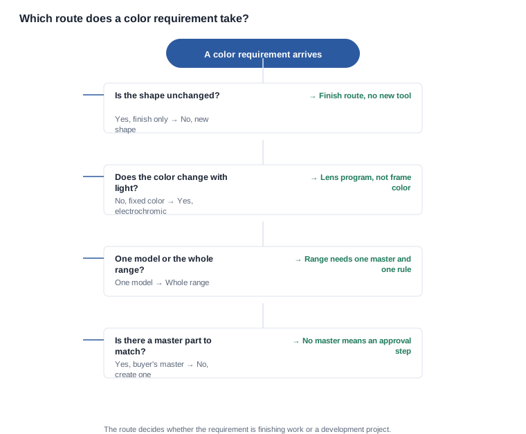
The decision path above is short, and it exists to stop one specific error: treating a color requirement as a finishing operation when it is actually a development project. The route decides which quotation you should ask for, which schedule you should be given, and which acceptance criteria apply.
One more point about scope belongs here rather than later. "Our color" is not one requirement. A brand color across a range typically becomes three or four distinct requirements — one per material-and-finish pairing in use — each with its own master, its own tolerance and its own minimum. A brief that asks for "brand blue" once, on the whole range, is a brief that will come back with three quotations and a question about which one applies where.

Customization options across the frame: temples, lenses, hardware
A frame is not one color decision. It is five or six, and the technical constraints are not evenly distributed across them.
The front and brow carry the largest visible area and the least technical constraint. This is the surface a brand color is normally placed, and it is the surface where a printing or coating process has the most room to work.
The temple arm is different on the camera tier, because the temple carries the electronics — the cell, the protection circuit, the board, and on the camera models a sensor module. A temple that has to house those components has less surface available for a clean color field, and more likely a split between a coated section and a moulded section. The temple color options in the range are covered in the temple colors article, which takes the temple geometry question in more detail than the frame program does.
The temple tip is a wear surface. It is frequently specified in a different color from the temple — usually a darker or softer-touch section — and it is the part a customer notices when the product is two years old. Its specification should be deliberate rather than inherited from the temple.
The hinge and hardware are rarely painted. Screws, hinge bodies and decorative metal are plated or anodised, and the process limit differs from a paint limit. A hardware color that looks achievable on a sample can be outside the achievable range for a plated part at volume.
The lens and the inner rim are where the tint and the frame color meet. A tinted lens changes the perceived color of everything behind it, so the frame color next to it has to be judged through the lens, not next to it. The lens material question is covered in the lens materials article; for the color program the practical point is that the frame and the lens have to be reviewed as one object.
The electrochromic entry sits outside all of these. It is the one catalogue entry where the color changes with an applied voltage, and it carries no model string. Because it carries no model string, it cannot be quoted as a configuration of a named model. It is a development discussion, and it is the natural point to ask what the actual models are, what the switching behaviour is, and what the published specification of that entry does and does not contain.
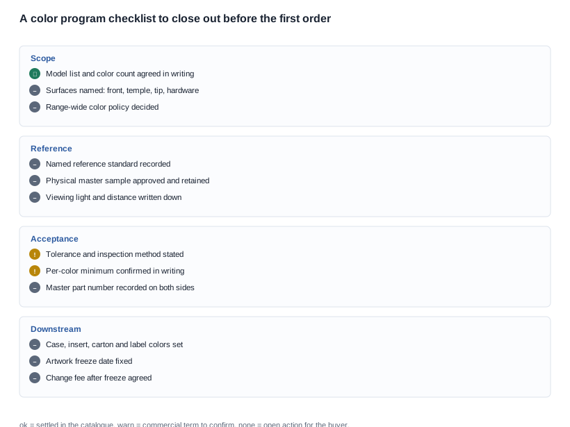
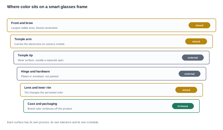
One more color sits outside the frame entirely and is often missed in the brief: the packaging and the case. A brand color that exists only on the product reads as an afterthought next to a carton in a different color. The standard color options across the range are set out on the standard OEM color options page, and they are the reference for what a program can inherit rather than develop.
For an eyewear brand, the interaction is sharper still. A heritage frame has a color system — a specific shell color, a specific temple color, a specific hardware finish — and a smart-glasses program has to decide how much of that system survives contact with a battery, a board and a charging method. The preserving frame design discussion covers how that trade-off is usually framed.

Customization options and the color reference that has to be agreed
Most color disputes are not color disputes. They are reference disputes: two parties believed they were looking at the same standard, and they were not.
A specification that survives production needs six parts, and it is worth writing them in this order:
- The material or substrate. The same pigment behaves differently on different substrates, and a color approved on one polymer may not be reproducible on another. Where the range supports several materials — and the material options published for the range are set out on our materials and ergonomics page — the color reference has to name the material it applies to.
- The finish. Gloss, satin, matte, soft-touch and texture each change how a color reads under light, and a matte version of a color is a different color to a buyer.
- The reference standard. A named, published reference — a Pantone or RAL reference, or the buyer's own master part — and not a description. "Brand blue" is not a specification.
- The surfaces it applies to. Front only, front and temple, front, temple and hardware. The same reference against three surfaces is three colors, in practice.
- The viewing condition. Under what light the comparison is made, at what distance, and against what background. A booth light, a retail shelf light and a phone screen produce three different judgments of the same part.
- The tolerance and the inspection method. How close is close enough, and by what method — visual comparison under a stated light, instrumental measurement by a stated method, or both, with the instrument and the method named.
That sixth item is the one we cannot fill in for you. No color-matching tolerance is published for any model, because a tolerance is a property of a specific material-and-finish pairing rather than a property of a product. The color matching article goes into the mechanics of building a reference and the inspection language that goes with it.
The practical replacement is an acceptance criteria list that names the method rather than the number. Something along the lines of: parts are approved by visual comparison to the retained physical master under a stated light, and by instrumental measurement where the method is stated. Then the question of how close is close enough is answered by the buyer's own standard, which is the right place for it.
The physical master deserves one more sentence because it is the cheapest insurance in the program. One approved part — production-representative, in the final material and finish — retained by both sides, referenced by a part number, and photographed under a stated light for the record. Every later question about color is answered by putting the two parts side by side.
Customization options: the two errors that cost the most time
The first error is approving a color from a screen. A photograph of a part is a photograph of a part under one light with one camera. It flattens texture, it lies about gloss, and it cannot represent a part seen from an angle. The usual result is that the printed, coated or plated part arrives and does not match, and the remedy runs through new artwork, new plates, new coating setup, and possibly scrapping of finished units.
The rule is dull and effective: no color is approved from a screen. A screen image may be used to shortlist, never to sign off.
The second error is treating a color change as a change of material, or as a change of anything except color. A buyer who reads "we can do your color" may hear "the rest of the product is unchanged", and the rest of the product is not unchanged. A coated surface adds thickness. A different material changes the flex, the weight, the durability and the perceived quality. And on a sport or cycling program the weight question is decisive, because a gram of temple changes the balance on the head — the weight optimization discussion for sports and cycling brands sets out how that trade-off is usually handled.
The only published weight figure in the entire catalogue is on the MT6: 158 g for the glasses, explicitly excluding its 1200 mAh foldable case. It is the single model in the range where a buyer can talk about weight against a number rather than a feeling, and it is worth using as the reference point for any program where a coating, a color system or a temple revision is expected to change the mass.
A third, quieter error completes the set: forgetting that the color programme extends past the product. The case, the insert, the carton, the label, the manual cover and the cable pouch all carry color. They are produced on different schedules, from different print or mould processes, with their own minimums. A brand color that is not specified for those items will be supplied in whatever the default is, and it will be visible in exactly the place a customer opens the box.
Customization options in a color program: the order of work
A color program that runs in the right order is mostly waiting; a color program that runs out of order is mostly rework. The sequence below is the one that works.
Step one — shortlist the models. Pick the models from the published range that carry a color row or that you intend to develop. The V03 Pro and the V06 are the two published anchors. Any other model in your range is a development item, and it should be named as one from the start.
Step two — fix the surfaces. Decide which surfaces carry the brand color and which stay in the default. This decision has to come before the artwork, because the artwork is different for every combination.
Step three — confirm the material and finish. Use the published material options as the starting point, confirm which of them the supplier will actually run for your color, and confirm whether the color is a coating, a print or a plating process.
Step four — create the physical master. Produce one part in the intended material and finish, have it approved in person where possible, retain it on both sides, and record the approval in writing with the part number and the viewing condition.
Step five — freeze the artwork. The color reference, the surface map, the part number and the approval record are frozen together, with a date. Everything after this point is a change request.
Step six — approve the pre-production sample and then the golden sample. Two different objects with two different jobs. The pre-production sample proves the configuration builds and the color is achievable. The golden sample is the reference that production units are judged against, and it becomes part of the acceptance criteria.
Step seven — write the acceptance criteria. Per color and per surface: the reference, the method, the tolerance source, who inspects, at what point in the process, and what happens to a non-conforming unit. This is where the inspection criteria belong, not in a verbal agreement with the factory.
Step eight — settle the commercial position. Unit price per color, the minimum order quantity per color, the setup cost per color, the artwork change fee after the freeze, the packaging minimum, the price ladder by volume, and the delivery terms. All of these are not published, and all of them differ from the standard-configuration figures.
The questions to ask the supplier, so that nothing important is left to a sample:
- Which color options exist today for the models in my range, and for which surfaces?
- Which of my surfaces are coated, printed or plated, and which process is used for each?
- What is the lead time for a color that does not exist as a standard option?
- What is the minimum order quantity per color, and how does it differ from the product minimum?
- Is there a setup or plate cost per color, and is it per order or per year?
- Can you supply a production-representative physical master for approval, and who retains it?
- What tolerance do you inspect to, by what method, and where is it written?
- What is the artwork change fee after the freeze, and how is a change request handled?
- Which collateral items carry the color — case, insert, carton, label — and what are their minimums?
- What does the golden sample look like, and how do you judge production units against it?
Three of those questions deserve a note, because they are the ones that decide the commercial shape of the program rather than the technical one.
Question 4 is the exposure question. A per-color minimum is inventory. If the answer is a number per color per material, the working capital in a four-color range across two materials is a real figure, and it belongs in the range plan before the launch date is chosen rather than after the first purchase order lands.
Question 5 is the amortisation question. Setup and plate costs are usually quoted per order rather than per year, which means they recur for the life of the color rather than once. A program that assumes a one-off setup cost will discover otherwise on the second order, usually at the moment it is least convenient.
Question 7 is the enforceability question. If the answer names a method — a stated light, a stated instrument, a stated comparison procedure — then the acceptance criteria are real. If it returns a number with no method, the criterion cannot be applied consistently by an inspector and disputes become arguments about perception rather than about parts.
The negotiation levers are specific rather than generic. The unit price ladder by volume is the obvious one. The per-color minimum is the second, because it is often the number that quietly sets your inventory exposure. The artwork change fee is the third, and it protects you more than a first-order discount does. The fourth is the packaging minimum, which is frequently larger than the product minimum for a low-volume color run.
Two red flags to watch for. The first is a supplier who confirms a color without asking which surface you mean — it means the confirmation is about their default program, not your product. The second is a supplier who quotes a tolerance without naming a method, because a tolerance without a method is not measurable and therefore not enforceable.
The pitfalls that recur in color programs are: approving from a screen, matching to a printed catalogue page rather than to a physical part, forgetting that the lens tint changes the perceived frame color, changing the color after the tooling is cut, and treating a per-color minimum as if it were the product minimum. Every one of them is a document problem, and every one of them is solved by writing the reference down early.
What we publish, we publish precisely: three color options for the V03 Pro with photochromic lenses, four colors for the V06, and nothing else. What is not published, we will ask about, answer in writing, and put into the order as a line with an owner.
Related reading